“Your visuals should be as unique and impactful as your ministry's message. Don't let default settings overshadow your distinct voice.”

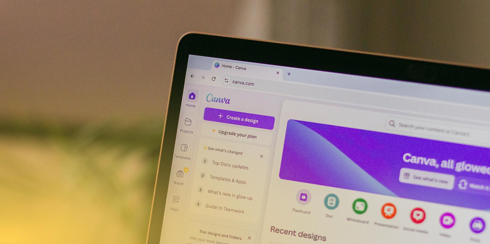
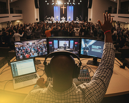
In today's ministry landscape, tools like Canva have become indispensable. They've democratized design, allowing anyone to create visuals for social media, sermon slides, and event flyers, often with limited time and budget. This is a huge blessing!
However, the accessibility of Canva can also lead to common pitfalls. What starts as a quick solution can sometimes unintentionally dilute your message or make your ministry look less professional. The good news? These mistakes are easy to spot and even easier to fix.
Here are the top three Canva mistakes we see ministries make, and how you can avoid them to ensure your visuals truly honor your message.
Mistake #1: Over-Reliance on Default Templates Without Customization
Canva offers thousands of beautiful templates, and they're a great starting point. The mistake isn't using them; it's using them straight out of the box without tailoring them to your brand. When every church in town uses the exact same "Sunday Service" template with only the text changed, your unique identity gets lost.
The Fix: Brand It Like You Mean It!

“Your visuals should be as unique and impactful as your ministry's message. Don't let default settings overshadow your distinct voice.”
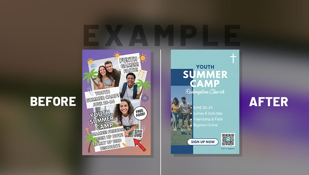
Mistake #2: Cluttered Designs & Too Much Text
The desire to communicate everything can often lead to communicating nothing. Overloading a graphic with too many fonts, colors, images, and blocks of text makes it difficult to read and understand at a glance, especially on social media feeds. In a scroll-heavy world, attention spans are short.
The Fix: Less is More – Prioritize Your Message
Mistake #3: Neglecting Image Quality & Licensing
Using blurry, pixelated, or low-resolution images can instantly make your design look amateurish. Furthermore, grabbing random images from Google without checking licenses can lead to copyright issues, which no ministry wants.
The Fix: Quality & Legality Go Hand-in-Hand
Elevate Your Ministry's Visuals
Canva remains a powerful asset for ministries, but like any tool, it's most effective when used strategically. By avoiding these common mistakes and embracing a more intentional, branded approach, you can create visuals that are not only aesthetically pleasing but also powerfully communicate your message and reflect the excellence of your ministry.